When I’m training a new writer on my team, they’re often surprised that my instruction goes well beyond grammar and voice.
The words on the page are only part of the experience a reader has with a piece of content.
How the content is structured, the flow of information, the formatting of the text, even the placement of the images goes a long way to creating a better content user experience.
I call this “Content UX,” and it’s a useful framework for helping a writer look beyond their words to the experience they’re building with the content they’re writing.
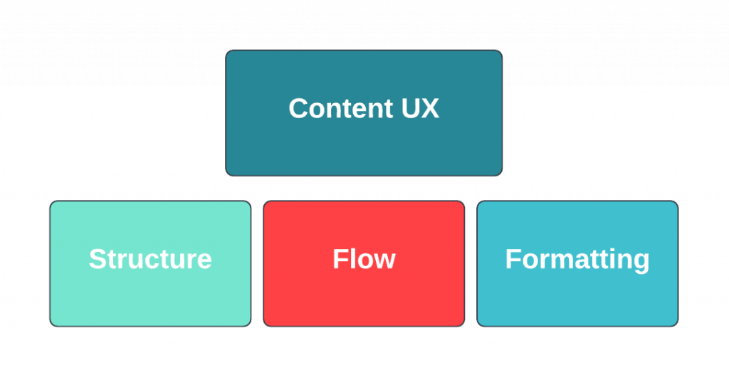
Content UX is the experience the reader has with the content. The three primary elements are structure, flow and formatting.

Structure
- Ease of navigation. Is the content easy to get around?
- Cognitive load. Is there sufficient white space to give the reader’s brain rest stops along the way?
- Balance. How does the content balance, visually? Are any graphic elements well balanced with the text?
Flow
- Ease of use. Is the content easy to read?
- Flow of information. Does one point lead naturally into the next in a logical sequence?
- Endpoints. Are there clear beginning and ending points?
Formatting
- Formatting. Is text formatting (H1, H2, bullet points, numbered lists, bold, etc.) applied to guide the reader’s attention?
- Headers. Do the subheads tell the general story of the content?
A copywriter’s job is to write words that move a reader to action — but the words can’t do their job if they are embedded in a poor UX.
While a writer doesn’t often have much control over the UX of the website or PDF where their content is published, they can improve their odds of success anywhere if they write with Content UX in mind. Good Content UX makes content easier to consume, more likely to be retained, and more effective for conversion.
