When clients come to me, they’re often trying to solve some specific problems.
Something just isn’t working right. They’re not getting the results they’re after. They understand they’re behind the curve in some way.
The good thing is that most of those problems are measurable. We can baseline where they’re at, and then determine the goal for where they want to be.
Even though the companies I talk to are so different — offering different technologies, different services, even different engagement models — they mostly have the same issues, and the same solutions often work to solve those issues. So over time, I’ve collected a list of go-to checkpoints for common problems.
Here are a few of the problems that come up again and again, and the fixes I’ve found work well in most cases.
Problem 1: Low Email Open Rates
According to IBM research, the average email open rate for large businesses in the U.S. is 23.1%. For smaller and medium-sized businesses, Get Response found the average email open rate in North America was 19%.
Nowhere near those numbers? That’s okay! It’s usually a very fixable problem.
Often, it’s a subject line issue.
The subject line alone can stop an email recipient from clicking through. Maybe it isn’t compelling, or maybe it just turns them off, or doesn’t relate to them — any of which can lead to the recipient clicking the delete button immediately, without even giving the email a chance.
So first, pay more attention to your email subject lines. Are they intriguing (without being click-bait-y, of course)? Are they relevant to the content of the email, and relevant your target audience?
A/B testing is the best way to find out which kind of subject line appeals most to your audience. Most email marketing software programs these days offer A/B testing features — so take advantage!
I came across a study recently with interesting results: Every Cloud found that the subject lines that see the best open rates are those that include the company name. While partly I can see why — this clearly communicates who the email is from and what the reader might find inside — partly I’m floored by this. A company name takes up a lot of subject-line real estate, leaving little room for the actual subject line. Unless your subject line is incredibly short, adding the company name can lead to the subject line getting cut off in the reader’s inbox (most email tools cut off the subject line around 60 characters). This is something I’m now testing with a couple of HPC clients to see if their open rates improve when we add the company name to the subject line.
Here’s an example from DataStax where the company name is in the subject line. As you can see, it does make the cutoff:
![]()
Sometimes, the problem is segmentation.
Sometimes the open-rate issue is a segmentation problem. If you’re sending your marketing emails and newsletters to your ENTIRE email list, you’re going to see lower open rates for sure. Sending to the entire list means your emails aren’t targeted — everyone gets served the same information and the same story. If you try to be everything to everyone, you won’t be anything to anyone.
Look at your email list segmentation. Your low open rate could mean that you’re sending emails that aren’t relevant to the recipients.
Segment your list by industry, state of awareness, source of opt-in, role, interest, what action(s) the reader has been taking — or a combination of attributes. The more targeted you can make your emails, the better results you’ll get.
Experimenting with the sender name can sometimes yield positive results.
Sending your emails from a nameless, faceless mailbox may be easy and keep things simple on your end — but it may have unintended consequences on the receiving end. This is basic human psychology: An email subscriber can’t feel personally connected to “Company News.” Getting an email from the founder of the company, or the marketing director, or another real human being is a totally different story. We can connect with other human beings in ways we cannot connect with group mailboxes.
Try using a real person’s name and email address as your sender. Some of my clients have seen upticks in open rates by making this simple change.
Surprise! Sometimes the low open rates are caused by a device issue.
These days 54% of people are reading emails on mobile devices.
Are you 100% sure that your email recipients are having a good user experience when they open your emails on their mobile devices? If not, check your latest marketing email on your smartphone right now.
A lot of email marketing uses templates or tables that get funky when you open the email on a smaller screen. After one or two bad reading experiences, your audience is trained not to bother opening an email from you — and they’ll delete future emails instead of opening them from there on out. And considering that 70% of consumers will immediately delete an email that doesn’t present well on their mobile device, making sure your emails are responsive and mobile-friendly can be a quick and easy way to boost the results of your email marketing.
Problem 2: Low Email Click-Through Rates
Your subject lines and segmentation are good. Your emails are responsive and easily read on desktops, tablets and smartphones alike.
But your click-through rates remain low! Now what?
Look at your intro.
When it’s done well, the introduction pulls recipients into the email and moves them to keep reading. This is your opportunity to get your audience invested in the content.
If you’re sending an email from an individual (not from a group mailbox) and it’s not a newsletter, personalize the email to make a connection right off the bat and help the reader feel that you know who they are — like they’re more than just a name on a big list to you. Addressing the reader by name is incredibly easy to do with today’s email marketing software.
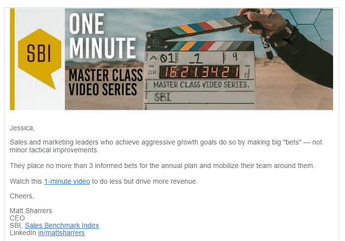
Here’s a solid example from Sales Benchmark Index. It’s being sent from the CEO, so the personalized intro rounds out the user experience by making it feel more like a 1-1 email.
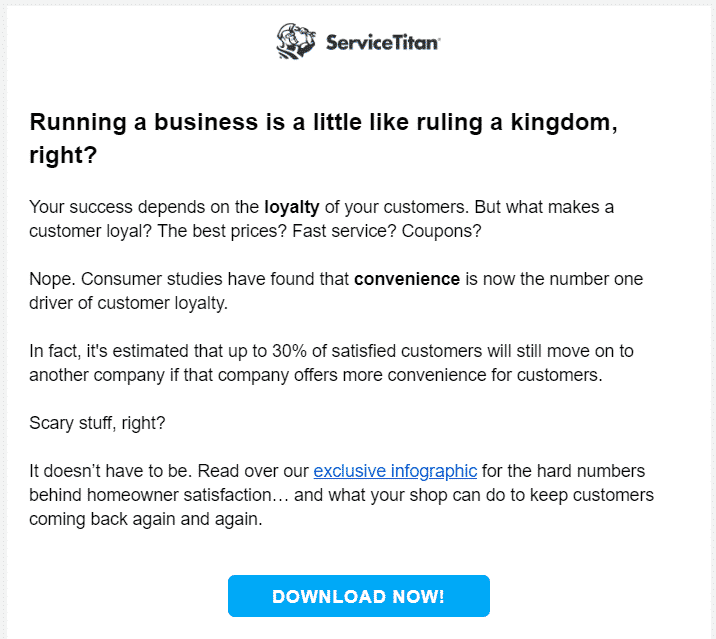
After you’ve personalized the introduction, look at your first couple of sentences. Are they compelling, interesting and relevant? Relevancy is more important than most marketers understand — it’s evidence of your understanding of your customers. You can see why segmentation is so important here, too. Making a first sentence relevant to 1,000 people is much easier than making it relevant to 50,000.
I thought this email from ServiceTitan was particularly good:
Look at your narrative.
One word: flow.
Your emails should flow easily, one paragraph to the next. A discombobulated email will confuse your customers — and instead of taking the action you want them to take, they’ll simply delete the email.
There should be some form of narrative in every email you write — no matter the subject, no matter the length. You don’t have to tell a big story, per se, but you do have to have a beginning, middle and end that work together, make sense, and lead the reader sensibly to the CTA. You don’t want the CTA to come out of the blue and have no relevance to the email copy.
Look at your CTA.
The most important email element to look at to improve your click-through rate is the CTA.
Include just ONE call to action.
(Caveat: Newsletters are an exception. I’ll get to that in a moment.)
Make the next step as simple as possible with ONE thing for the reader to do.
One link to click. One reply to make. One button to click.
Don’t ask the reader to follow you here, read more on this blurb there, and subscribe to your YouTube channel when what you really want them to do is check out your latest blog post.
If you ask people to do too many things, they won’t do anything at all. It’s called decision overwhelm — and your click-through rates will suffer from it.
If you absolutely have to have more than one call to action, I am limiting you to two. Yes, consider this email law, now. No more than two unique CTAs AND you have to give them visual distance. One CTA can go in the main body of the email, and the other in the PS. Visual distance is absolutely critical to defeating decision overwhelm in this (hopefully rare) instance!
Outreach.io usually does a good job with keeping their emails on-point — but even they have fallen into the trap of including two CTAs, too close together. Here’s an example (yes, the bolded text right above the button is a link).
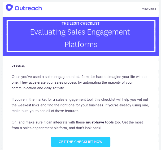
Do you see how confusing that is to the reader? “Get this checklist! No wait! Look at these tools! No, get the checklist!”
I don’t think there’s a good case for having those two CTAs in this same email — but if they had a compelling business reason for it, I would have suggested they put the “must-have tools” CTA in a PS with enough text to give it visual distance from the button.
In this email, they did a better job of driving the reader to take a single, crystal-clear call to action:
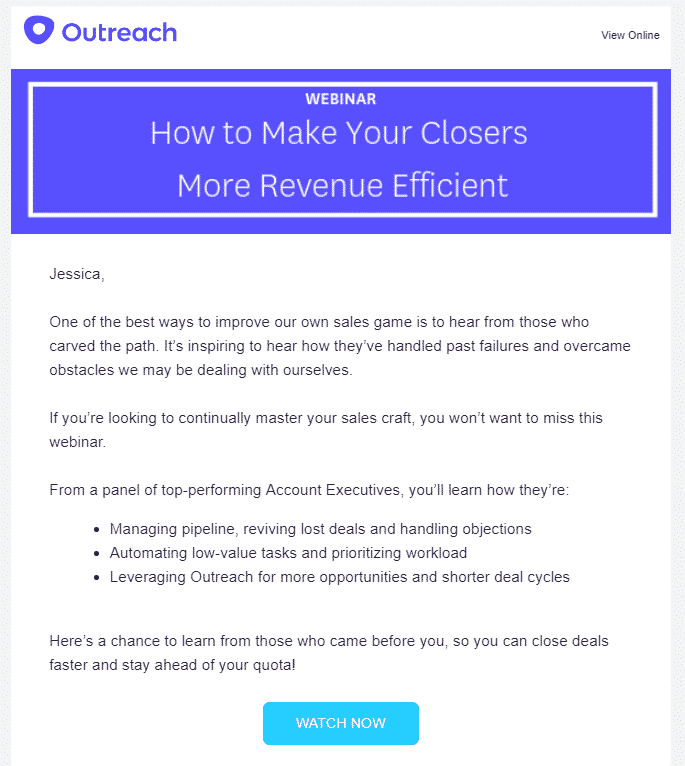
Email newsletters are different beasts, of course. By their very nature they are going to have more than one call to action — and this is fine. You’re going to have a different goal — likely educational or authoritative — with a newsletter than you will with any other kind of email. Visual distance still works well to keep decision overwhelm to a minimum, though. Separate your CTAs with compelling copy, strategic white space, and visual elements like images.
Problem 3: Low Landing Page Conversion Rates
Generally, if you’re seeing low conversion rates on your landing pages, I find that those landing pages are suffering from schizophrenia.
Take a good hard look at the same areas we reviewed above: introductory statements, narrative, CTA, mobile responsiveness, etc. The user experience on a landing page should be simple, compelling, relevant and crystal clear.
A lot of the time, though, landing pages are simply too long.
This is not a sales page, where you have 10 pages to convince the reader to take action. The visitor got to your landing page by taking at least one action already — they clicked through from your email, chose some premium content they want to download from your website, etc. Now you’re asking them to take the next logical step, most likely providing their name and email address in exchange for something. If there is too much lead-up to the ask … it’s exhausting. Your visitor’s cognitive energy is already spent — so get to the point!
Keep your landing page concise, clear, and compelling. Narrative and the psychological benefits of storytelling can help with this. Craft a compelling story around the “why” behind the action you want them to take. For example, “Download this white paper to learn more about this important thing happening in your industry,” or “Register for this webinar to see this new software functionality before it goes live to the public.”
Don’t be repetitive. Do be clear. Trim the fat.
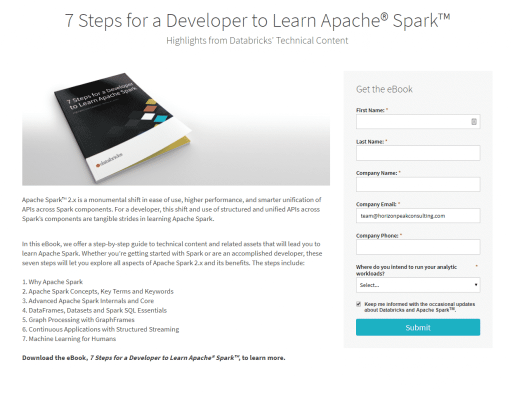
Many landing page templates today have the email opt-in box on one side of the page. This can give you a good visual cue of how long the copy should be. If your customers have to scroll past the opt-in, you’re losing them.
Take a look at this landing page from Databricks. Do you see how the copy stops where the opt-in box stops? The reader doesn’t have to scroll past the CTA. Thumbs up.
Problem 4: Low Conversion Rates on Standalone Assets Like Whitepapers
Each content asset you create — white paper, e-book, infographic, whatever! — should lead to the next step in the customer journey. Each one should have a CTA (just one, remember) at the end.
The effectiveness of this CTAs comes right back to that narrative flow. Does the content naturally lead the reader to the CTA at the end?
One of the first things I want to know when I take on a content writing project is what we’re asking the reader to do at the end. If I know this when I begin writing, I can write toward that goal. That helps me make the CTA feel like a natural next step.
Sometimes a client will tell me “Oh, we’ve got a boilerplate CTA we’ll add to the end of that white paper,” — and I know we’ve got a problem. There’s no place for boilerplate if you want to move the reader to action. A boilerplate CTA tacked on at the end of a content asset is boring at best, and completely out of place at worst. There needs to be a natural, next-step flow to the offering and request. The CTA must be relevant. Yup, there’s that word again.
If you don’t start with the CTA in mind — and write toward that CTA — you risk creating a dead end for the reader.
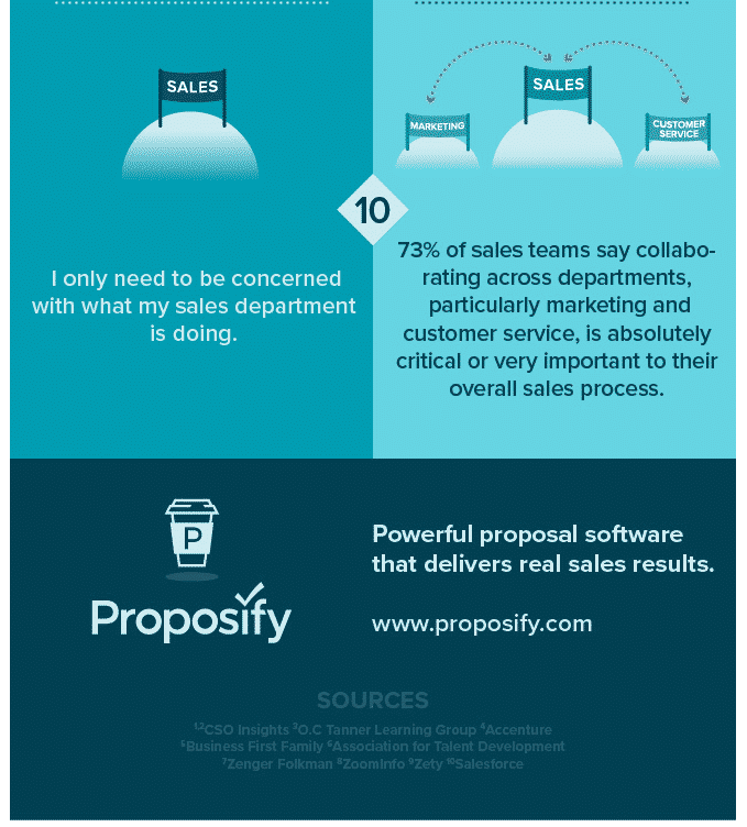
This is the bottom of an infographic from Proposify, and it’s a good example of a boilerplate CTA. It’s not a bad call to action … but it isn’t a very effective one. The topic of the infographic is sales management expectations vs. reality, and there’s no organic lead-up to this CTA.
This doesn’t have to be a big, complicated endeavor. If I were the infographic copywriter for Proposify, I’d add some “connective tissue” above the “Powerful proposal software” copy — just one brief sentence tying the topic to the CTA.
You could be asking too much of the reader.
The CTA should also be a reasonable request of your target audience. Keep in mind their awareness of the problem you’re solving.
If your target reader’s awareness is low and your content topic is therefore high-level, don’t ask them to talk to a sales rep! They’re not ready for that, yet. It’s too much of a jump. A more reasonable request might be to read another (more in-depth) piece of content around that topic, or visit a webpage that goes more in-depth about a solution you’re suggesting. Your goal should be to increase their awareness, not push the sale just yet.
And vice-versa: If your target reader is highly aware of their problem, and already realizes your solution may be an option — so your topic is narrower and more in-depth — asking them to schedule a call with a sales rep is a more reasonable request.
The point is, the CTA should always be a natural next step. If you’re not converting readers on your standalone content assets, the problem is most likely that conversion doesn’t feel like the natural thing to do at the end.
Start With These Easy Fixes
If you’re experiencing any of the four problems discussed in this post, there may be a bigger issue at play: poor product/market fit, misunderstanding who your customer is, poor writing, etc. But in my many, many years of experience helping B2B companies improve the results of their content marketing strategies, the recommendations I’ve made here fix a lot of problems. So start here. If your results still aren’t what they should be, or if you need help implementing any of these recommendations, reach out to me here at Horizon Peak and let’s talk!.
